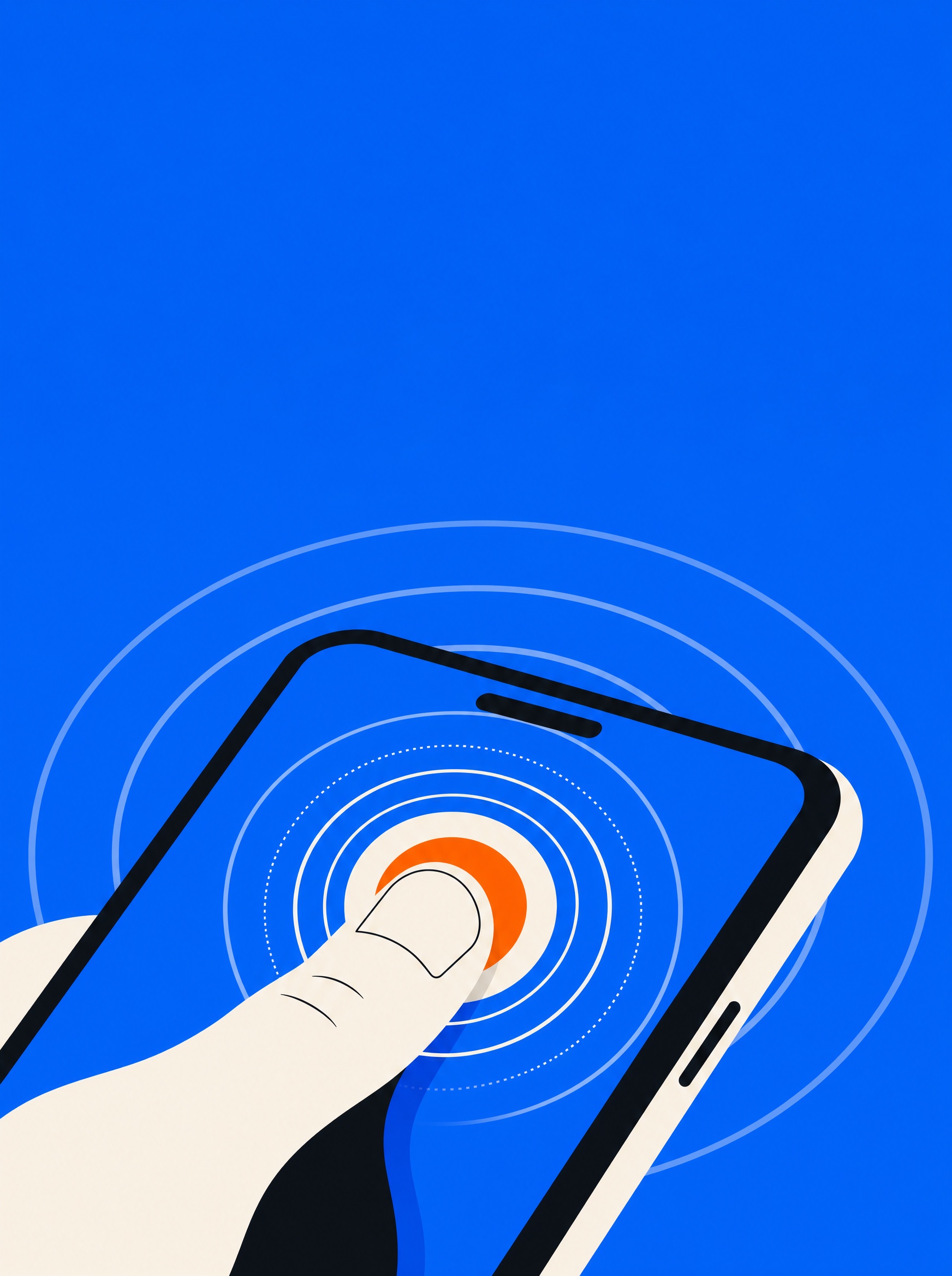
44 points: the smallest big number in mobile design
Turn VoiceOver on and leave it on for a week
In this
issue
- 0144 Points or BustTap Target
- 02Your Thumb Is the Primary UserTap Target
- 03Turn VoiceOver On and Leave It OnTap Target
- 04Type That GrowsTap Target
- 05Motion Sickness Is a Bug, Not a PreferenceTap Target
- 06"I Don't Test With Screen Readers. I Live Here."Tap Target
- 07The Ship-It ChecklistTap Target
2
44 Points or Bust
Apple says 44 points. Google says 48dp. WCAG will accept 24 pixels if you beg. Behind the numbers is one physical fact: the average adult fingertip, and the decade of tiny buttons we shipped anyway.
Go smaller and you're not designing a button, you're designing a lottery.
Your Thumb Is the Primary User
Half of all phone use is one-handed, the screens keep growing, and the thumb hasn't gotten any longer. Reachability isn't a nice-to-have — it's the physics your interface lives in.
Everything above the thumb arc is, functionally, a two-handed zone.
Turn VoiceOver On and Leave It On
You cannot design what you have never used. One week of screen-reader immersion will teach you more about your app than a quarter of analytics.
If the visual hierarchy and the reading order disagree, the reading order is the truth.
Type That Grows
Dynamic Type is the most-used accessibility setting on iOS, and the most commonly broken. If your layout dies at 200%, it was never finished.
If your layout dies at 200%, it was never finished.
Motion Sickness Is a Bug, Not a Preference
Parallax, zooms and springy sheets are delightful until they meet a vestibular disorder. Reduce Motion is not a request to make your app boring — it's a request to stop making people ill.
The inner ear says we're moving; the body objects.
"I Don't Test With Screen Readers. I Live Here."
Amara Osei is a senior mobile engineer who has been blind since twelve — she builds the interfaces she can't see, and reviews yours faster than you can. A conversation about VoiceOver at 700 words a minute, the myth of the accessibility sprint, and what teams get wrong on day one.
Ten years ago accessible was something you built. Now it's something you break.
The Ship-It Checklist
Ten checks before any mobile release. Print it, tape it to the wall, block the merge.
The difference between accessible teams and the rest is only where the blocking happens.
— End of Issue 1 —
The mobile accessibility magazine. Design for every hand, eye and ear.
Subscribe — £5/month10
Contents
Pages